Building things - simple components, lots of reuse
Templating is always a balance of extraction vs re-use. Often I start out with basic outlines of components and over time develop a more mature version, guided by what they need to do and how they need to adapt to a design, it can be hard to know what you will and won’t need from the outset.
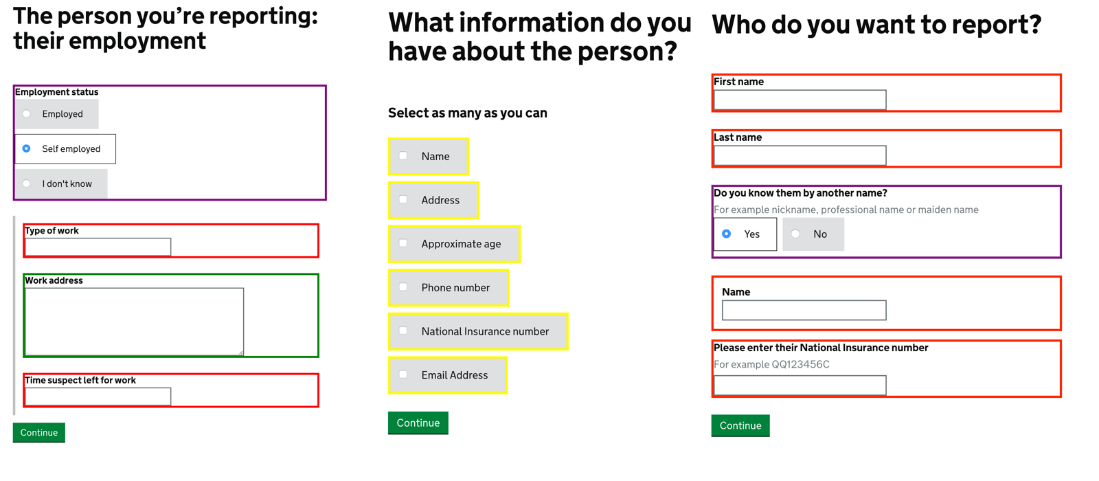
Not all services are the same, but most require core components. I sat down and reviewed the ‘Report Benefit Fraud’ service which is now in private beta to see what I had used across the service.

Just six components are used to build the whole of the service (excluding layout), in total it has about 20 pages. Below is a list of the components it used.
| Input Name | Times used | Variations | |
|---|---|---|---|
| text field | 32 | 3 | |
| text area | 15 | 0 | |
| checkbox | 14 | 1 | |
| date field | 3 | 1 | |
| radio buttons (sets) | 3 | 1 |
These templates where built using Nunkucks, which is now used in the GOV.UK prototyping tool kit.

You can view examples of the macros I used here. These are slightly trimmed down but can still be used to produce most of a service.
They started to get a little bloated with variations of the same component, largely this was a styling thing, i.e. a shorter text field or a non-bold label.
The main focus of the components is to make a easily re-usable block, that consistently handles errors and values without additional logic. This was done to reduce the amount of logic and testing required in the service.