nunjucks for govuk elements - moving to consumable code
Some time ago I shared nunjucks macros (git) based around a couple of services I had built.
These are a bit haphazard and had no testing around them at a component level (though they were well tested in a service.).
They were also bloated due to never refactored, as my move to a new project team, it seemed a good time to tidy them up
Shared Understanding
I had some time to sit down and plan what I was going to next, a version of govuk-elements-marko already exists, so aligning and improving both together makes sense.
Excellent work has already happened to define components and add tests around them. It seemed sensible to try and share these to make a common defined schema for input.
I have a lot of services using nunjucks/express, so this should help have less code across services and promote reuse.
Marko is also javascript based templating. This means we can share unit tests, so behaviour will be consistent across the implementations.
Getting started
I seem to be using nunjucks/express as my default build for a lot of services, this has a pre-requirement of having an express app.
First, it will need to be installed.
// this will add govuk-elements-nunjucks to your package.jsonnpm install https://github.com/htmlandbacon/govuk-elements-nunjucks.git ---saveWe’ll then need to make the component available to the render, this can be done by configuring the views in the express server, this will depend on your setup. This will now expose the components folder for importing into a view.
// import macro for use{% from "gov-input/macro.njk" import govInput %}
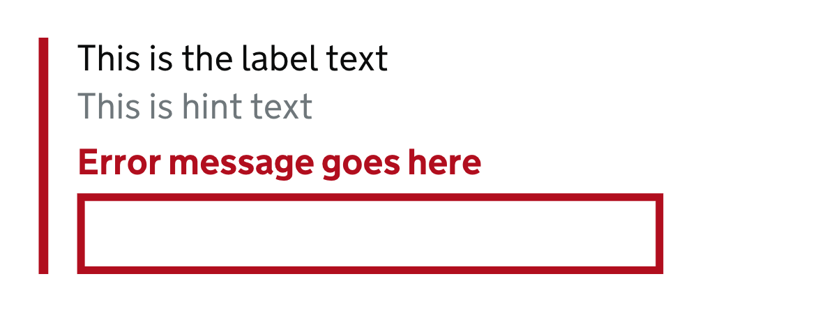
// call macro with values{{ govInput(id="field",      name="field",      error="Error message goes here",      hint="This is hint text",      maxlength="40",      label="This is the label text") }}
This will render the below.

Before this gets published to NPM I need to export the other components, like the ones in the marko repo.
I also need to work out how to allow more styling control, as often the defaults need to be overridden to make a flexible component.