Good forms create good experiences
It was interesting reading Forms that Work: Designing Web Forms for Usability by Caroline Jarrett and Gerry Gaffney. This was published in 2008, and all it still remains true today.
If you’ve ever used a recent Government service - you’ve should have experienced a lot of what I am going to talk about.
If you’ve never used one you can look at GOV.UK elements - which is a collection of components used to build services.
I figured it would be good to talk about some of the themes of the book in relation to my work.
The right moment for the question
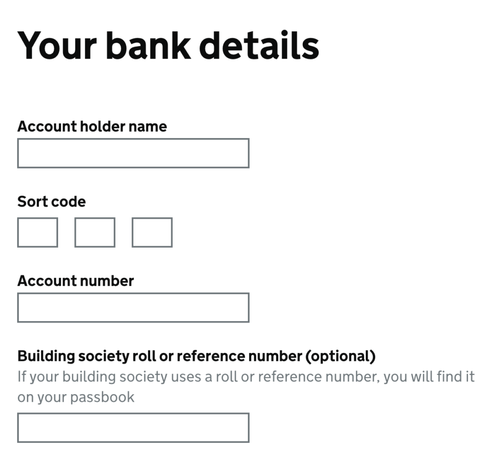
The ordering of how you ask information is a key to building trust within a transaction. Bank details are a good example of this.
Amazon has a very stepped order, with a natural feel building towards bank details.

On Get your State Pension it is about the 5th screen (depending on flow). By this time the user has already given a few bits of information so it feels more natural, this page does have drop outs.
Removing the burden from the user another key point, most services I’ve worked on have had very few optional questions. There is no need to mark questions as mandatory.
I’ve seen forms produced by development teams where every field label started with an asterisk denoting it was mandatory.
Chances are if a question is optional it will have been removed. It is good to ask if we actually need the question at all. If the answer is no, then why are we asking it?
In some cases, extra questions such as contact details can be helpful, but don’t give any benefit to the user.
Design
Starting with ‘one thing per page’ (form structure) is a great way of splitting up your form. This will help with grouping form fields too.
As that one thing might be your address or your name. It is important to be clear about the information you need and to make sure it is linked.
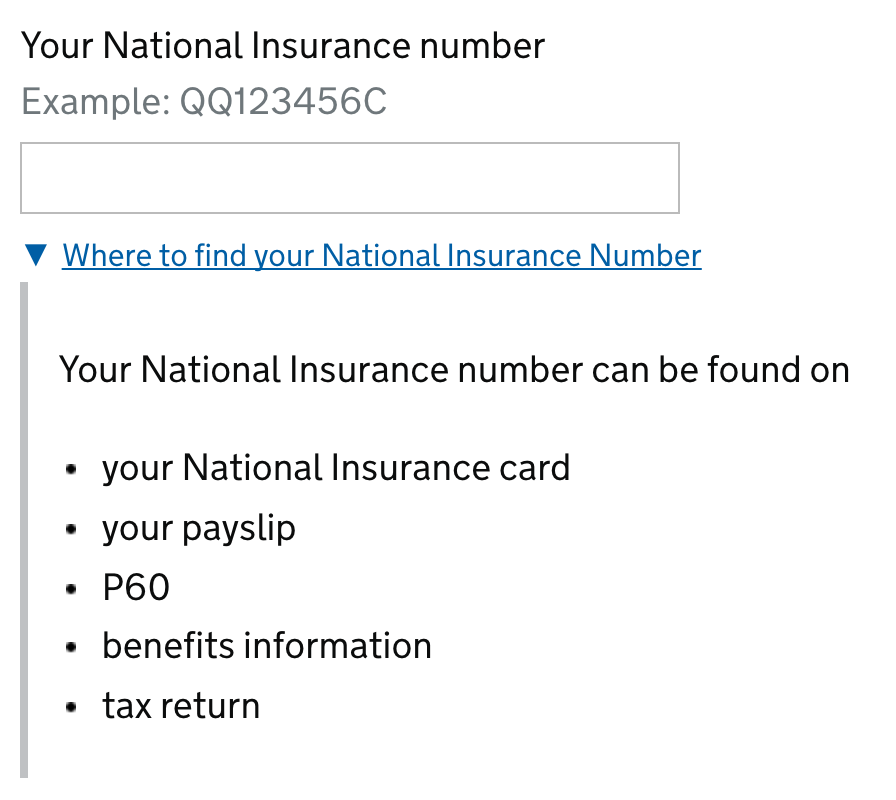
Directing a user can useful in helping them find the information. Of that information is not something they use often i.e National Insurance Number/Driving Licence example.
Layout
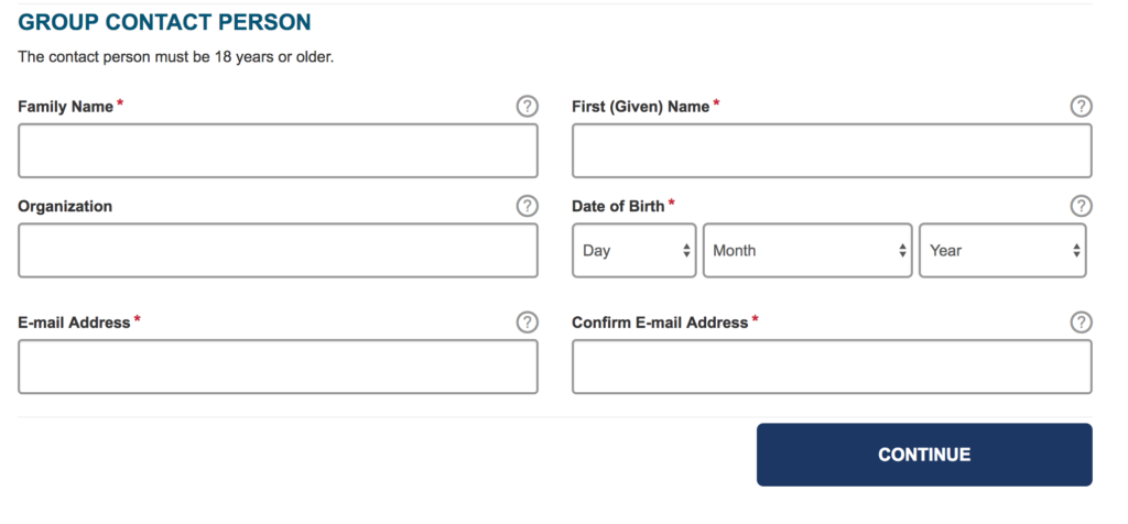
Unless it is an admin system most forms in Government will generally be a single column this will help with readability as a user will not have to read right to left.
It also means a user with vision difficulty won’t have to scan the page for more fields.
labels
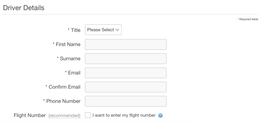
There are a few ways you can position a label on form fields. In general above the field is the best for a visual connection. Left aligned labels can have too much distance between its self and the element. Right-aligned labels can look odd if you have long text.


It is also recommended to use sentence case, this generally tests better than title case with users.
Options
Radio buttons are a great way to expose the data hidden in a select box - this will let the user see the information without having to click anything.
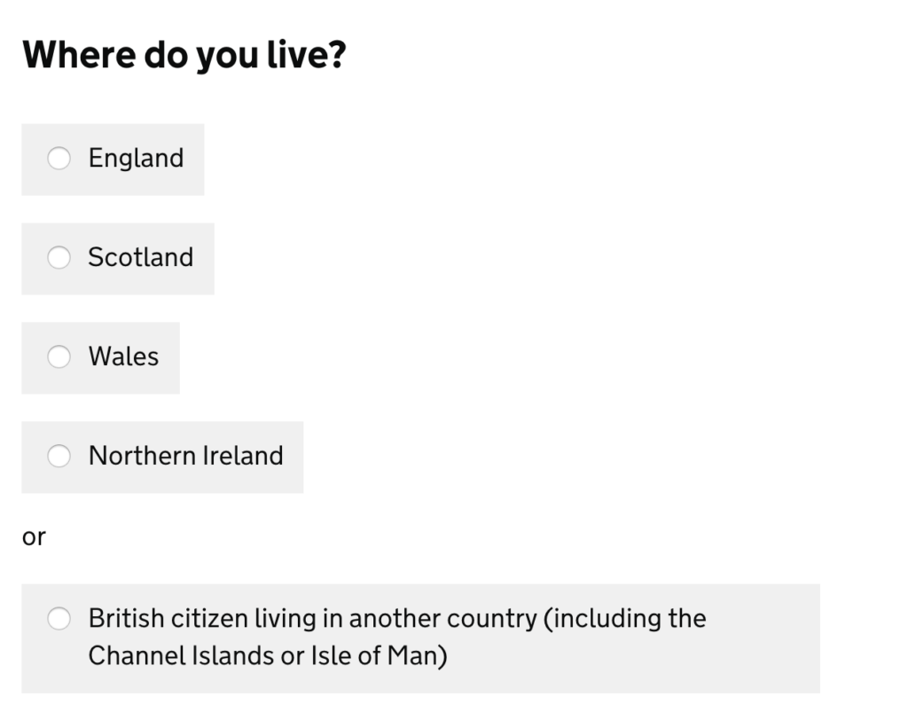
This won’t work for all fields that have multiple options. Inputs like autocomplete can useful, as long as the user understands what we require from them, a country list is a good example of this.
Making sure the answers fit the question is important, the example in the book was with room types, does the user understand what the room type is?
Probably not as room types can vary quite a lot per hotel.

This is an example of one room type at a hotel, it has three different payment, this is an example of multiple selects as a list.
In this hotel example, there is actually 9 rooms, with 3 variations each.
Errors & Validation
Having clear descriptive errors to the user is important. A summary of these with quick links to fix the problem is also a great way to highlight and provide a quick route to the field that needs updating.
Chasing when to validate is also important. I’ve seen forms validate in real time, this will often break the users’ concentration, which can be annoying as they haven’t finished yet.
Doing either on submit of a button or exit of a field is a better way of doing the validation.
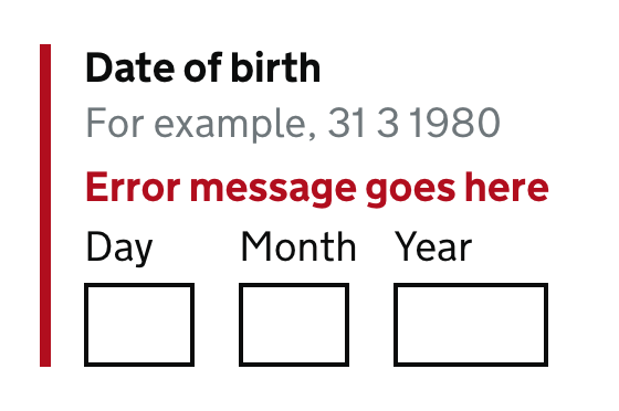
Test with users
To validate any design it should be tested with real users. It is a great way to check the assumptions you have made while designing or developing a form are correct.
Expanding this to test with users that have accessibility needs is a great way to highlight potential issues.